
A useful UI prompt reads like a product specification. It names the canvas, hierarchy, real content, components, states, responsive rules, and acceptance checks. Visual style comes after those decisions. That order gives GPT Image 2.5 enough structure to produce a mockup that a designer can review and a developer can interpret.
Start from the Image3 homepage, open the GPT Image 2.5 Flare Workspace, and keep the GPT Image 2.5 model page nearby while you test the prompts below. Flare is the practical first pass for rapid iteration. Sunburst is an option for a later, higher-fidelity review frame. Test both against your own screens rather than treating that distinction as a universal benchmark.
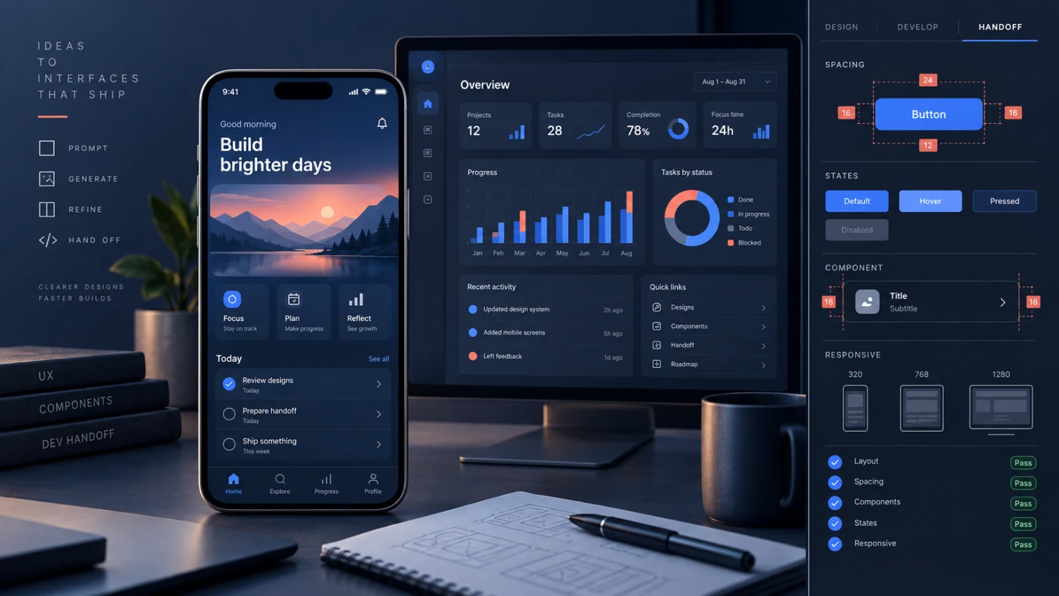
The image and short video above are editorial illustrations of this workflow. They are not benchmark outputs or screenshots of a shipped product.
Quick answer: prompt the system behind the screen
Do not begin with "make a modern finance dashboard." That request leaves the model to invent the product, the data, the navigation, and the definition of modern. Give it a screen contract instead:
PRODUCT: subscription analytics for a small software company.
USER JOB: find the cause of a monthly revenue drop in under 30 seconds.
CANVAS: desktop web app, 1440 x 1024, content width 1200.
HIERARCHY: page title, date range, four summary metrics, trend chart, change table.
NAVIGATION: left rail with Overview selected; Billing, Customers, and Settings below.
EXACT COPY: use only the labels and values supplied in the DATA block.
COMPONENTS: metric card, segmented date control, line chart, sortable table, status chip.
STATES: include a visible loading pattern and an empty-table variant on a small state sheet.
STYLE: sober B2B product UI, neutral background, blue accent, compact spacing.
AVOID: invented logos, fake testimonials, decorative glass effects, tiny unreadable text.
OUTPUT: one main screen plus a narrow component-state strip.
This prompt makes the important decisions inspectable. If the chart dominates the page, you can change hierarchy. If the empty state is missing, you can request it directly. A mood-only prompt gives you fewer handles for repair.
Why attractive UI mockups fail at handoff
A generated screen can look finished while leaving its behavior undefined. The navigation may contain five destinations on desktop and seven on mobile. A card may show a success state but no loading or error case. A data table may use plausible numbers that nobody supplied. These gaps become product decisions during implementation, when they are slower and more expensive to resolve.
The image is also a flattened artifact. It does not carry component names, tokens, breakpoints, semantic structure, keyboard order, or data contracts. Treat it as a visual proposal. The handoff packet must state the rules that are invisible in the pixels.
Use the mockup to answer visual questions: Does the information order make sense? Is the main action obvious? Can the dense region breathe? Use written requirements for behavior: What happens while data loads? Which columns disappear below 768 pixels? Where does validation text appear? What remains accessible without color?
The seven fields in a screen contract
Every production-oriented UI prompt should cover seven fields. They can fit in one page of text.
| Field | Decision to record | Failure it prevents |
|---|---|---|
| User job | One task the screen must support | A page that looks busy but has no priority |
| Canvas | Device, width, height, and content area | A layout with no realistic constraints |
| Hierarchy | Ordered regions and dominant action | Equal visual weight across everything |
| Content | Exact labels, values, and limits | Invented data and unstable copy |
| Components | Named repeated interface parts | Inconsistent cards, controls, and spacing |
| States | Loading, empty, error, disabled, success | A happy-path-only design |
| Responsive rules | Invariants and allowed transformations | Unrelated mobile and desktop screens |
Write content as a separate block. If the model may invent filler, say where. If every label is controlled, quote every label. Keep charts qualitative unless you supply verified numbers. A realistic-looking chart still makes a factual claim.
CONTENT POLICY
Use exactly these navigation labels: Home, Trips, Saved, Profile.
Use exactly this page title: Plan your next trip.
Use these sample cards: Coastal escape, City explorer, Mountain trails.
Do not add prices, ratings, review counts, badges, destinations, or promotional copy.
If a text region is not specified, leave it blank rather than inventing text.
Choose Flare or Sunburst by the next decision
Model choice should follow the decision you need to make. Use Flare while the layout is still moving: screen order, component scale, density, navigation, and responsive structure. Faster iterations matter because most early drafts should be discarded.
Try Sunburst after the screen contract has settled and a detailed review frame would help. That might include a polished presentation image, a nuanced visual direction, or a difficult edit that needs closer inspection. Higher visual fidelity does not repair an incomplete product requirement. A vague Sunburst prompt can still produce a vague screen.
The AI image generator gives a broader entry point, while the GPT Image 2 prompt library is useful when you want to compare prompt structures beyond UI work. Keep the chosen model and quality setting in your handoff notes so another teammate can reproduce the generation context.
Mobile onboarding prompt
Onboarding needs a finite job. This example helps a new user connect a calendar and choose notification timing without turning the screen into a marketing carousel.
Create a three-screen mobile onboarding flow for a calendar assistant.

CANVAS
- Three iPhone-like artboards at 390 x 844, shown side by side.
- Respect safe areas. Use one consistent 8-point spacing system.

SCREEN 1: CONNECT
- Heading: "Connect your calendar"
- Supporting line: "See open time without changing existing events."
- Primary button: "Connect calendar"
- Secondary text link: "Not now"

SCREEN 2: CHOOSE
- Heading: "When should we remind you?"
- Three radio options: 10 minutes before, 30 minutes before, 1 hour before.
- Select 30 minutes before.

SCREEN 3: READY
- Heading: "You're ready"
- Show a compact sample agenda with two events.
- Primary button: "Open my day"

SYSTEM RULES
- Keep button position stable across all three screens.
- Use one illustration style and one icon family.
- Show progress as 1 of 3, 2 of 3, 3 of 3.
- No testimonials, pricing, gradients, logos, or extra setup steps.
Review the output as a sequence. Back navigation should be possible on screens two and three. The chosen notification value needs a visible selected state. The final screen should not introduce a new permission request that the prompt never defined.
SaaS dashboard prompt
A dashboard prompt needs a question, not just a list of widgets. The user job below determines the page hierarchy.
Design a desktop SaaS dashboard for a support operations lead.
The user must identify which ticket category caused today's backlog.

LAYOUT
- 1440 x 1024 canvas with a 240-pixel left navigation rail.
- Header: "Support overview", local date, team selector.
- First row: Open, Waiting, Resolved today, Median first response.
- Main region: backlog by hour chart on the left, category table on the right.
- Bottom region: five oldest open tickets with owner and age.

DATA
Open 184; Waiting 36; Resolved today 92; Median first response 18 min.
Categories: Billing 71, Login 48, Generation 39, Export 26.
Do not add percentages or trend claims.

INTERACTION CUES
- Billing row is selected and filters the hourly chart.
- One visible "Clear filter" control appears above the chart.
- Sort indicator appears only on the Backlog column.

STYLE
Compact operations UI, off-white canvas, dark ink text, blue selection accent.
Avoid decorative illustrations, oversized cards, glass effects, and fake alerts.
Check every number against the data block. Then ask whether the selected Billing row and filtered chart can be understood without relying on color alone. Add an icon, label, or border treatment if the relationship is ambiguous.
Pricing page prompt
Pricing pages fail when visual emphasis silently changes the offer. Control the plan names, prices, included items, exclusions, and CTA labels.
Create a responsive pricing page for a team note-taking app.

PLANS
Free: $0, 3 projects, 1 GB storage, community support. CTA: "Start free".
Team: $12 per member monthly, unlimited projects, 50 GB storage, email support.
CTA: "Start team trial". Mark this plan "Most selected".
Business: $28 per member monthly, SSO, audit log, priority support.
CTA: "Contact sales".

DESKTOP
- 1440-pixel canvas, three equal plan columns, Team centered.
- Put the monthly billing note beside the price, not in a distant footer.

MOBILE
- 390-pixel canvas, plans stacked Free, Team, Business.
- Keep every price and CTA visible without a horizontal carousel.

RULES
- Do not invent discounts, annual prices, guarantees, customer counts, or features.
- Use check marks only for included items. Write exclusions as plain text.
- Give Team stronger border contrast without enlarging its price.
After generation, compare the plans line by line. A missing exclusion or invented discount is a product error, even if the page looks credible. Rebuild exact pricing text in code rather than treating generated typography as production artwork.
Empty, loading, and error state prompt
Generate states after the reference screen has a stable component system. Reuse the same container dimensions so the layout does not jump between states.
Using the approved project-list screen as the visual reference, create a state sheet.

Show four versions of the same 720 x 420 content panel:
1. DEFAULT: three project rows with name, owner, status, and updated date.
2. LOADING: three neutral skeleton rows with no fake words or numbers.
3. EMPTY: heading "No projects yet", one sentence, button "Create project".
4. ERROR: heading "Projects couldn't load", message "Check your connection and retry.",
   primary button "Retry", secondary text link "View status".

PRESERVE
Panel size, title position, column alignment, background, border, radius,
type scale, spacing, and action placement.

ACCESSIBILITY CUES
Do not communicate error or loading state by color alone.
Keep focus outlines visible on Retry and Create project.
Do not put the only explanation inside an icon.
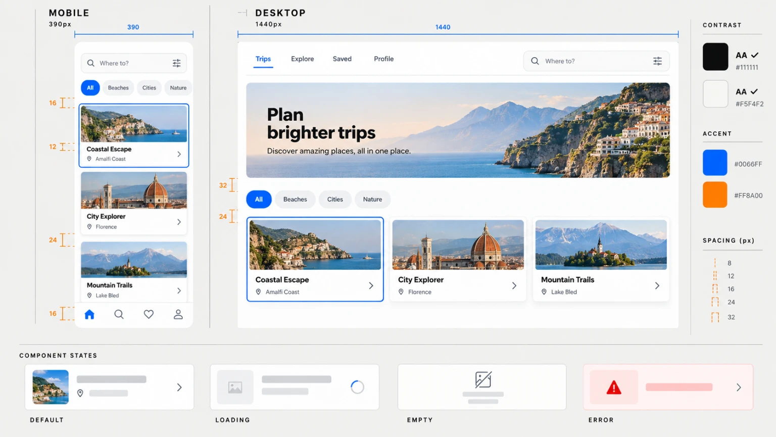
The illustration above is a QA reference made for this guide. It shows the categories to inspect, not a production component library.
Responsive mobile and desktop prompt
Two unrelated artboards do not define responsive behavior. State the invariants first, then list the allowed transformations.
Create paired mobile and desktop screens for the same travel-planning product.

INVARIANTS
- Same content order: search, category filter, featured trip, remaining trips.
- Same card titles and destinations on both canvases.
- Same blue accent, image treatment, type family, and card radius.
- Search is the primary action at both widths.

MOBILE AT 390 PIXELS
- Bottom navigation with Home, Search, Saved, Profile.
- One-column trip cards with 16-pixel page padding.
- Category chips scroll horizontally on one line.

DESKTOP AT 1440 PIXELS
- Top navigation with Trips, Explore, Saved, Profile.
- Three-column trip grid inside a 1200-pixel content area.
- Search field sits in the header; category chips sit above the grid.

DO NOT
Change card copy, add destinations, hide the search action, or create a separate visual theme.
This paired prompt makes differences intentional. During handoff, turn each transformation into a rule: bottom navigation becomes top navigation at the desktop breakpoint; the card list changes from one to three columns; the search control moves but keeps the same job and label.
Settings and permissions prompt
Settings pages expose whether the mockup understands system behavior. Group controls by consequence and make destructive actions hard to trigger accidentally.
Design a desktop settings page for a shared workspace.

SECTIONS
Profile: name, role, profile image action.
Notifications: email digest select, product updates switch, mention alerts switch.
Security: active sessions link, change password button, two-factor status.
Workspace danger zone: leave workspace button.

BEHAVIOR CUES
- Show saved state beside Profile after an edit.
- Show a disabled Save button when no fields changed.
- Give switches distinct on and off states with text labels.
- Put "Leave workspace" in a separated danger zone with explanatory copy.
- Do not show a destructive confirmation modal in the same main screen.

LAYOUT
1440 x 1024, 240-pixel left rail, 720-pixel settings column, generous section gaps.
Use ordinary product UI, not a marketing landing page.
Ask reviewers to describe what each control does without guessing. If a switch has no label, a saved state has no duration, or the danger action looks like a normal navigation link, the visual needs a repair and the requirements need more detail.
Repair one region without losing the screen
A useful edit prompt names one defect, one region, the replacement, and the invariants. Do not mix a typography repair with a color redesign and a layout change.
EDIT ONLY THE HEADER OF THE DESKTOP DASHBOARD.
Replace the page title "Support Overveiw" with exactly "Support overview".
Keep the title on one line and preserve its current position, type size, weight, and color.
Preserve the date, team selector, navigation rail, metrics, chart, table, spacing,
background, borders, and every other visible word.
Do not add any new labels or icons.
Inspect the complete output after every edit. A corrected title does not help if the model also changed two metrics. If collateral changes appear, return to the cleanest prior version and narrow the edit request further. For visual consistency across later screens, the brand-style reference workflow explains how to keep identity, palette, lighting, and composition rules fixed. For dense visual hierarchy, use the infographic prompt workflow.
Build the developer handoff packet
The final mockup is one item in the handoff packet, not the whole packet. Attach the accepted screen and record the decisions that pixels cannot carry.
- Name each screen and its user job.
- List exact approved copy and sample data. Mark every placeholder.
- Map repeated visual parts to proposed components.
- Record spacing, type, color, radius, and elevation tokens as implementation values.
- Define loading, empty, error, disabled, success, and permission states.
- State breakpoint rules as invariants and transformations.
- Add keyboard, focus, label, contrast, target-size, reduced-motion, and error-recovery checks.
- List unresolved product questions with an owner instead of letting code answer them silently.
Developers should be free to correct impossible geometry, inaccessible interactions, and platform conventions. The mockup establishes intent. It does not override working software.
Audit the screen before implementation
Use four review passes. First, compare every visible word and number with the approved content block. Second, trace the main user job and confirm that hierarchy and actions support it. Third, inspect states and responsive behavior. Fourth, check the handoff packet for details that the image cannot express.
At full resolution, look for spelling, inconsistent spacing, distorted icons, accidental overlaps, and invented data. At 390 pixels, confirm that the heading, primary action, and state message remain readable. A design that works only at presentation size is not ready for implementation.
Do not use the mockup as evidence that the interface is accessible, usable, or technically feasible. Those claims require prototypes, code, and user or automated testing. Generated UI is strongest as a fast proposal that makes product decisions visible enough to debate.
A reusable final prompt
The template below keeps product requirements ahead of visual decoration. Remove fields that do not apply, but do not replace them with adjectives.
Create a [mobile/desktop/responsive pair] UI for [product].

USER JOB
[One task the user must complete.]

CANVAS
[Exact dimensions, content width, safe areas, grid, and outer padding.]

INFORMATION ORDER
1. [First region and its purpose]
2. [Second region and its purpose]
3. [Third region and its purpose]

EXACT CONTENT
[Approved navigation, headings, labels, values, messages, and CTA copy.]
Do not invent text or data outside this block.

COMPONENTS
[Named controls, cards, tables, navigation, charts, forms, and repeated patterns.]

STATES
[Default, hover, focus, loading, empty, error, disabled, success, permission.]

RESPONSIVE RULES
Preserve: [content, order, action, and visual-system invariants].
Transform: [navigation, columns, wrapping, hiding, or reordering allowed at each width].

VISUAL DIRECTION
[Specific product style, type roles, palette roles, density, borders, and imagery.]

QUALITY CHECK
No invented logos, data, features, testimonials, badges, watermarks, illegible microcopy,
inconsistent component styles, or color-only state signals.
Run the template in the GPT Image 2.5 Flare Workspace. Return to the Image3 homepage when you want to compare other image workflows, and use the GPT Image 2.5 model page to choose the next generation route. Keep the winning prompt, accepted image, repair history, and written handoff rules together. That packet is what turns a generated screen into a reviewable product decision.
Frequently asked questions
Which GPT Image 2.5 model should I use for UI mockups?
Start with Flare when layout and content are still changing. Test Sunburst when a higher-fidelity review frame could change a decision. Record the model and settings because results depend on the actual workload.
Can GPT Image 2.5 generate production-ready UI code?
No. The output is a visual reference, not a component tree or behavior specification. Build the interface in code and test it against the written acceptance criteria.
How do I keep text accurate in a UI mockup?
Supply exact copy, reduce the amount of text per screen, and inspect every label and number. Repair one text region at a time while preserving the rest of the image.
How should I prompt mobile and desktop versions?
Give both canvas widths. Separate invariant content and actions from the navigation, grid, and wrapping rules that may change across breakpoints.
Should I generate every app state in one image?
Stabilize one reference screen first. Then request a compact state sheet that reuses its dimensions, type, spacing, colors, and controls.
Does a polished mockup prove accessibility?
No. Check semantics, keyboard order, focus, labels, contrast, target size, motion preferences, and error recovery in the implemented interface.
How to apply this
- Write the screen contract
Define the user job, canvas, information hierarchy, exact copy, components, and interaction states before asking for visual style.
- Generate one reference screen
Use GPT Image 2.5 Flare to test the hierarchy quickly, then inspect the result at full size and mobile width.
- Add states and breakpoints
Request loading, empty, error, and success states plus a paired mobile and desktop layout with explicit invariants.
- Repair one defect at a time
Identify one region, quote the required change, and state which surrounding elements must remain fixed.
- Build the handoff packet
Transfer accepted copy, spacing, components, states, responsive behavior, and unresolved questions into a written implementation checklist.
Frequently asked questions
Which GPT Image 2.5 model should I use for UI mockups?
Start with Flare when you need quick layout iterations. Test Sunburst for a higher-fidelity review frame when the extra generation time is justified by your workload.
Can GPT Image 2.5 generate production-ready UI code?
No. A generated mockup is a flattened visual reference. Developers still need component definitions, responsive rules, accessible semantics, data behavior, and acceptance criteria.
How do I keep text accurate in a UI mockup?
Provide an exact copy inventory, limit copy per screen, inspect every label, and use a targeted edit prompt for one text defect at a time.
How should I prompt mobile and desktop versions?
Name both canvas widths, define what must stay consistent, and specify what may move, collapse, wrap, or become a different navigation pattern.
Should I generate every app state in one image?
Use one reference screen first. After its component system is stable, request a compact state sheet for loading, empty, error, disabled, and success variants.
Does a polished mockup prove accessibility?
No. Visual contrast is only one check. Keyboard order, semantic structure, screen-reader labels, motion preferences, target size, and error recovery need separate implementation tests.